
Layout - Pace and contrast
- Desislava Ilieva
- Jan 18, 2021
- 1 min read
Updated: Feb 9, 2021
"Compare the design (in terms of pace and contrast) of an online magazine, blog or website to that of a printed magazine, book or journal.
What differences can you see between the kinds of design strategies used in the two formats?
Write down your findings and upload it to Wordpress."
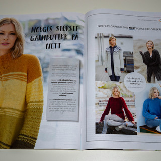
For this task I chose to compare the family magazine called "Hjemmet" with the company's website. (It was the only magazine I had)
Magazine:


Website:


First thing that grabbed my attention is how busy the magazine is compared to the website.
A lot of different colors, fonts and adds make the magazine very chaotic. The webpage on the other hand was clean and easy to read. The menu was easy to navigate and there were no adds, although I use Adblock, so I might not be able to see them at all.
At first I got confused if that website is even the right one...they just look completely different. I also noticed a very easy to see inconsistency with the font used for the name.
I think the big difference between the two is because the magazine is designed to be more entertaining and contain a lot of information without being boring to the reader. Also I'm sure companies pay a lot to have their commercials included in the magazine so that takes up space too.


Comments